
Designing a bathroom that welcomes both energetic little ones and overnight guests can feel like decorating two different rooms at once.
But here’s the beautiful truth: you don’t have to choose between playful charm and grown-up elegance.
The secret lies in creating spaces that layer personality with practicality, color with calm, and whimsy with sophistication.
Kids/Guest Bathroom Ideas
Whether you’re working with a shared hall bath or a dedicated powder room, these 15 ideas will show you how to design a space that makes kids excited for bath time while keeping your guests comfortable and impressed.
Let’s dive into designs that truly do it all.
1. Soft Sage and Warm Wood Serenity
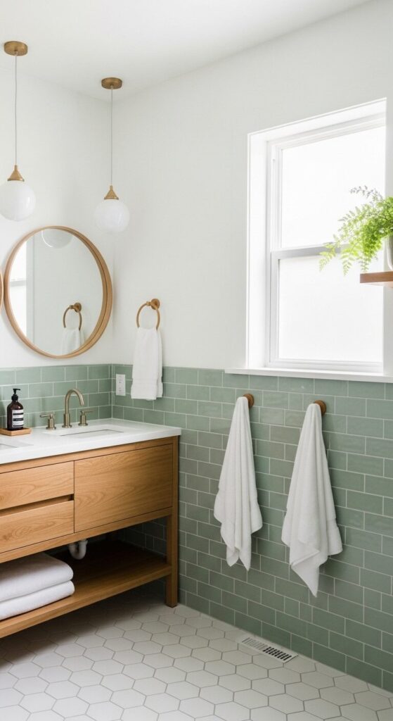
Sage green brings the outdoors in with a whisper rather than a shout. When you pair soft green tiles with warm wood tones and plenty of white, you create a bathroom that feels fresh and calming for everyone who walks in.
The color palette reads sophisticated to adults while feeling naturally inviting to children. Kids are naturally drawn to these earthy, nature-inspired hues that remind them of gardens and forests.
Choose a wood vanity with simple lines and plenty of storage to hide away colorful bath toys when guests arrive. The warm wood tones add instant coziness without feeling too rustic or juvenile.
Add texture through woven baskets, a jute rug, or wooden accessories. These natural elements bridge the gap between playroom and refined retreat beautifully.
How to Achieve This Look:
- Install sage or seafoam tiles to chair rail height, paint above in warm white
- Choose a wood-toned vanity with soft-close drawers (kid-safe!)
- Layer in natural textures: rattan baskets, bamboo toothbrush holders, linen towels
- Keep countertops minimal—one pretty soap dispenser and a small plant
How to Choose the Right Theme
Start by thinking about longevity rather than trends. Choose a foundation that can grow with your kids—soft neutrals, classic patterns, or nature-inspired palettes work beautifully for years.
Then layer in playful elements through easy-to-change accessories like towels, shower curtains, and wall art. This approach means you’re not renovating every few years, just refreshing small touches as tastes evolve.
2. Navy and Brass Nautical Charm
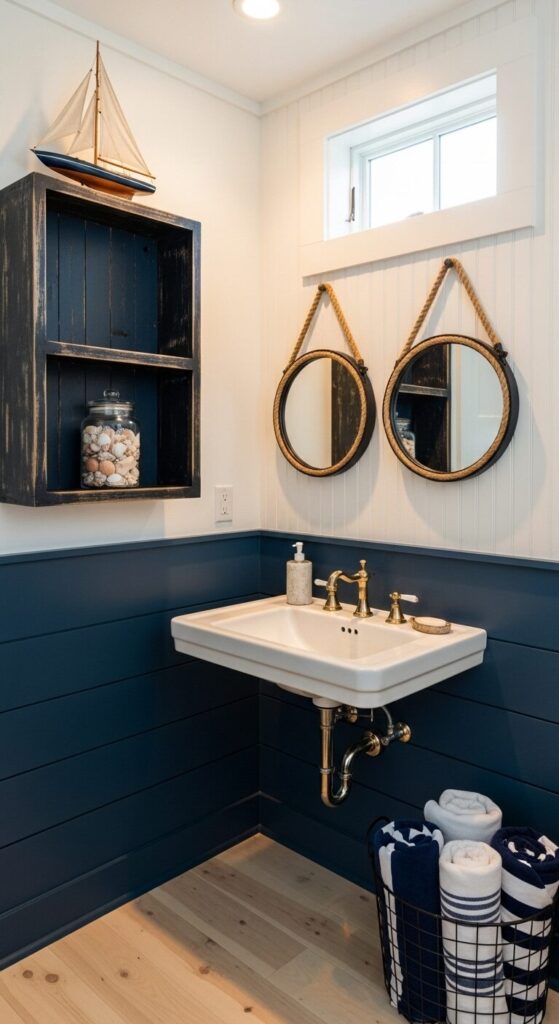
Navy blue brings depth and richness that feels both classic and playful. When combined with crisp white and warm brass accents, you create a coastal atmosphere that works for all ages.
Kids love the connection to ocean adventures and maritime stories. Adults appreciate the timeless elegance that never goes out of style.
The darker shade also hides toothpaste splatters beautifully between cleanings. This practical benefit makes daily maintenance so much easier for busy families.
Shiplap or beadboard adds architectural interest without overwhelming the space. Keep nautical touches subtle—think rope details and brass mirrors rather than cartoon fish.
This restraint means the room stays guest-worthy while still sparking imagination during bath time.
Style Tip:
- Paint lower walls or add shiplap in navy, keep upper walls bright white
- Choose brushed brass or gold fixtures for warmth
- Add 2-3 subtle nautical elements maximum (rope mirror, striped textiles, natural wood)
- Use white or light wood flooring to keep the room feeling spacious
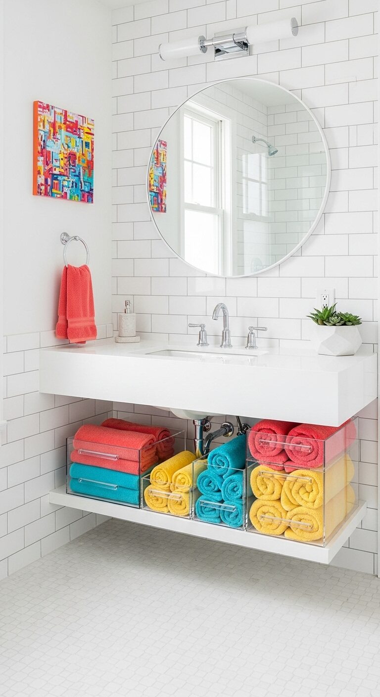
3. Cloud-White Minimalism with Pops of Color

Pure white creates the perfect blank canvas that adapts to whoever’s using the space. The clean foundation feels spa-like and sophisticated to adults.
Colorful towels and accessories inject personality without permanent commitment. Kids can pick their favorite towel colors and you can swap everything seasonally.
White surfaces show when cleaning is needed, making maintenance straightforward. The minimal aesthetic also means fewer places for clutter to accumulate.
This approach teaches kids organizational habits while keeping the space perpetually guest-ready. Just a quick tidy-up transforms it instantly.
How to Achieve This Look:
- Keep all permanent fixtures white: tiles, vanity, toilet, tub
- Invest in quality white towels as your base, add 4-6 colorful hand towels
- Choose one colorful element as a focal point (art, shower curtain, or rug)
- Use clear or white storage containers to maintain the airy feeling
Budget-Friendly Tips
You don’t need a full renovation to create a dual-purpose bathroom. Start with paint—it’s the most affordable transformation tool.
Next, update hardware like drawer pulls, towel bars, and faucets for instant polish. Shop vintage or secondhand for unique mirrors and lighting fixtures.
Save your budget for quality where it matters: a good vanity, durable flooring, and fixtures that withstand daily kid use while still looking beautiful.
4. Sunshine Yellow Happiness Station
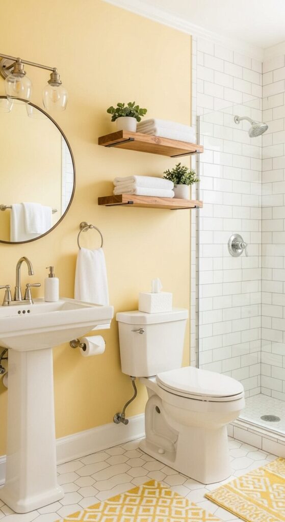
Soft yellow is inherently optimistic and welcoming. Unlike bright primary yellow that can overwhelm, butter or pale sunshine tones create warmth without intensity.
This color energizes morning routines for kids while making guests feel wrapped in a cheerful glow. It’s particularly magical in bathrooms with limited natural light.
Yellow creates the illusion of perpetual sunshine streaming through the windows. The key to sophisticated yellow is restraint and the right undertones.
Choose yellows with creamy or peachy undertones rather than stark lemon shades. Pair with crisp white to keep things fresh, and add natural wood and brass for richness.
This combination prevents the space from skewing too childish while maintaining joyful energy.
Style Tip:
- Paint one accent wall or use yellow tiles sparingly as a backsplash
- Balance with abundant white tiles, fixtures, and towels
- Add warm metals (brass, copper, or rose gold) instead of chrome
- Include one or two green plants—they make yellow sing
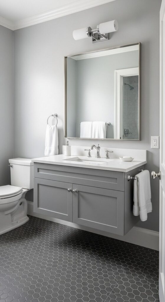
5. Modern Farmhouse Black and White
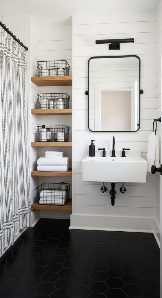
Black and white creates instant sophistication with playful graphic impact. The high contrast is visually engaging for children while reading as timeless elegance to adults.
Modern farmhouse styling softens the boldness with natural materials and comfortable textures. This creates a space that’s both striking and approachable for everyone.
Black fixtures and hardware hide water spots and fingerprints beautifully. The graphic floor pattern camouflages the inevitable spills and splashes of family life.
This palette is forgiving in all the right ways. The style works equally well in small powder rooms and larger bathrooms, adapting to any space with equal charm.
How to Achieve This Look:
- Choose matte black fixtures and hardware for a modern, not dated, feel
- Use black as an accent (20-30%) with white as the dominant color
- Add warmth through wood tones in shelving, frames, or accessories
- Keep patterns simple: stripes, checks, or geometric shapes
Quick Styling Checklist
✓ Storage first: Baskets, bins, and organizers that hide bath toys and toiletries
✓ Dual towel bars: Lower ones for kids, standard height for guests
✓ Step stool: Choose one that’s attractive enough to leave out
✓ Hooks everywhere: Kids use them more reliably than towel bars
✓ Quality basics: Invest in fixtures that withstand heavy use
✓ Easy-clean surfaces: Consider tile, paint finishes, and materials that wipe down quickly
6. Blush Pink and Marble Elegance
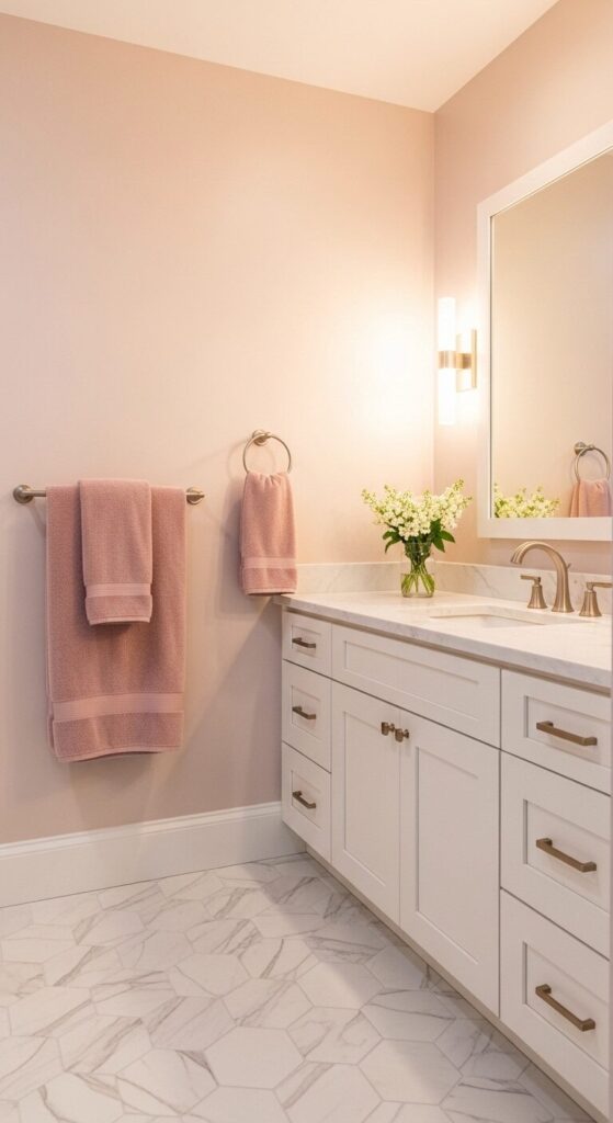
Blush pink has evolved far beyond traditional little-girl territory. It’s now one of the most sophisticated neutrals in modern design.
When paired with white marble and gold accents, it creates a soft, elegant atmosphere. Kids love the gentle warmth while guests appreciate the understated luxury.
The secret to making pink work for all ages is choosing dusty, muted tones. Blush has gray undertones that keep it sophisticated, especially with cool whites.
This combination creates a bathroom that feels like a calm retreat from busy family life. Warm metallics add just the right touch of richness.
Style Tip:
- Use blush on walls or as an accent color, not on permanent fixtures
- Pair with cool white (not cream) for the most sophisticated look
- Choose brushed gold or rose gold fixtures over shiny brass
- Add one marble element—even faux marble contact paper works
7. Underwater Adventure in Aqua and White
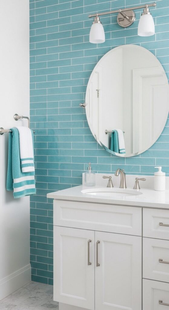
Aqua captures the magic of water without literal ocean themes. This blue-green shade feels energizing and clean for everyone.
The color psychology works beautifully for a bathroom. It’s associated with cleanliness, calm, and freshness while still bringing playful energy.
Using aqua tiles on just one wall creates a focal point without overwhelming. The rest of the room stays crisp and neutral for balance.
This ensures guests feel comfortable and the space doesn’t scream “kids’ bathroom.” The balance lets you embrace color boldly while maintaining versatility.
How to Achieve This Look:
- Choose aqua tiles for one accent wall or shower surround only
- Keep floors, vanity, and remaining walls white
- Use silver or chrome fixtures for a cool, crisp feel
- Add white subway tiles in other areas to tie everything together
8. Forest Green with Natural Elements
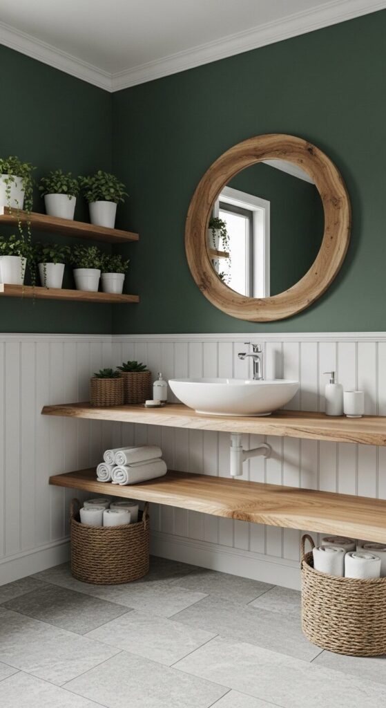
Forest green brings the tranquility of nature indoors with richness. This deep, saturated color creates an envelope of calm that works for all ages.
It helps wind down energetic kids while impressing guests with current, design-forward appeal. Green is proven to be one of the most relaxing colors for bathrooms.
The connection to nature makes this palette particularly smart for families. Kids naturally respond to colors that remind them of the outdoors.
Pair the green with natural wood, stone textures, and living plants. This isn’t cutesy—it’s sophisticated biophilic design that happens to resonate with children’s curiosity.
Style Tip:
- Paint walls in deep green, add white wainscoting or beadboard below for contrast
- Choose a wood vanity or add wooden accessories for warmth
- Include 2-3 real plants (pothos and snake plants thrive in bathrooms)
- Use matte black or oil-rubbed bronze fixtures against the green
Color Palettes That Work Best
Classic combinations that bridge playful and sophisticated:
- Soft gray + white + pops of any bright color
- Navy + white + warm wood tones
- Sage green + cream + natural textures
- Blush + white + brushed gold
- Black + white + one accent color
The formula: Choose one deeper color for impact, surround it with neutrals, add warmth through wood or metal, then layer in one bright accent through easily changeable elements.
9. Striped Statement with Gray and White
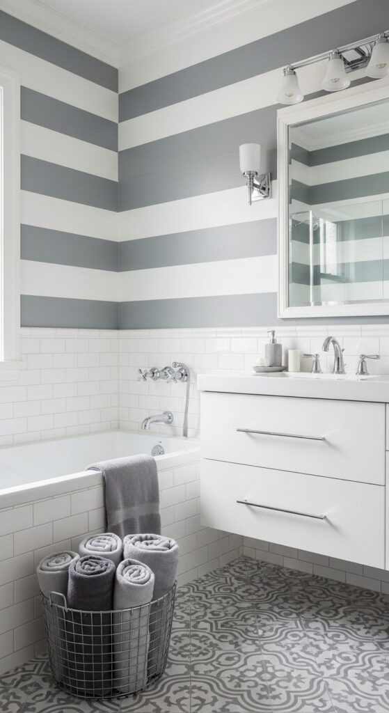
Stripes bring energy and visual interest without committing to a theme. Gray and white stripes hit that sweet spot between playful pattern and classic sophistication.
The linear design makes small bathrooms feel larger while adding personality. Kids notice and appreciate the pattern without it feeling babyish.
The beauty of stripes is their versatility for different needs. Horizontal ones widen narrow spaces, while vertical stripes create height.
Painting stripes is also a budget-friendly DIY project with dramatic impact. Choose a soft gray rather than stark charcoal to keep the space feeling light and welcoming.
How to Achieve This Look:
- Paint horizontal stripes in 8-12 inch widths for best effect
- Use painter’s tape and a level for crisp, professional lines
- Choose a warm gray (not blue-toned) for a softer feel
- Add pattern on the floor or in textiles, not both—pick one
10. Rainbow Bright with White Foundation
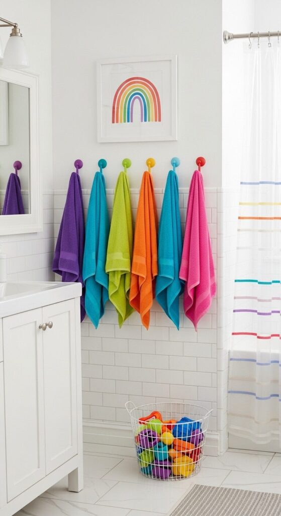
Rainbow colors celebrate childhood joy while staying organized and intentional. When permanent elements stay completely white, you can embrace full spectrum colors through accessories.
The space never feels chaotic because the foundation is so clean. Each family member can claim their own color, teaching organizational skills.
This approach is incredibly flexible for the dual-purpose challenge. When guests arrive, swap the rainbow shower curtain for solid white.
Put away the most playful elements in minutes. The white foundation means instant transformation from kid-central to guest-ready with minimal effort.
Style Tip:
- Keep walls, tiles, and all fixtures pure white—no exceptions
- Add rainbow through towels, hooks, bath mat, and one piece of art
- Choose soft pastels or primary brights, but be consistent in tone
- Use clear or white storage to let the colors be the stars
11. Vintage Penny Tile Pattern Play
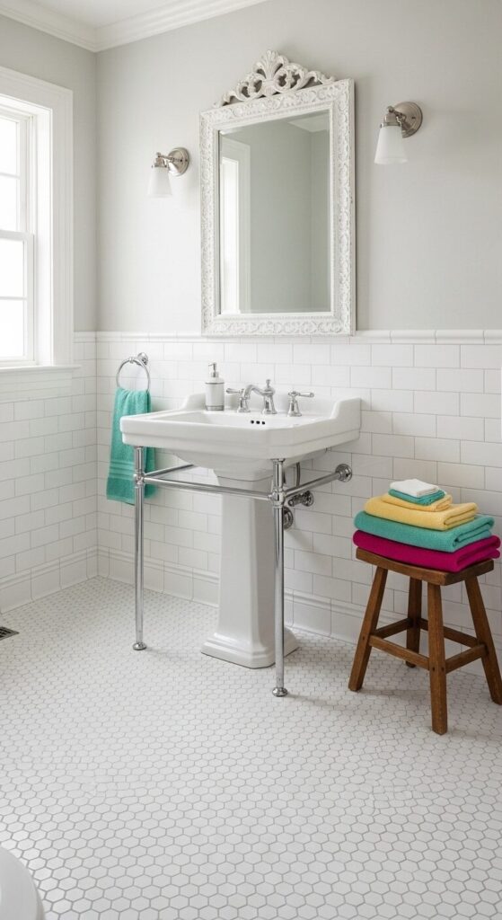
Penny tiles offer pattern and texture without overwhelming color or theme. The small-scale geometric design is engaging for kids while maintaining classic appeal.
This flooring choice is practical in important ways. The many grout lines provide traction when wet, making it safer for little feet.
The vintage-inspired look works beautifully in homes of any age. Penny tiles read as authentically classic in historic homes while adding character to new construction.
Pair with simple fixtures and minimal accessories to let the floor shine. This is sophisticated restraint that creates visual interest through pattern rather than color.
How to Achieve This Look:
- Use penny tile on floors, reserve subway tile for walls
- Choose classic white with white or light gray grout
- Add vintage-style fixtures: pedestal sink, exposed shower hardware, framed mirror
- Keep the color palette neutral with pops through towels only
Budget-Friendly Tips (Part 2)
Where to save money:
- Paint instead of tile (use bathroom-specific paint with proper ventilation)
- Peel-and-stick tiles for accents (technology has improved dramatically)
- Secondhand or vintage mirrors (adds character and saves money)
- DIY open shelving instead of built-in cabinets
- Basic white fixtures—they’re often the most affordable and never go out of style
Where to invest:
- Quality faucets and shower fixtures (these get heavy use)
- Durable, water-resistant flooring
- Good lighting (brightens the whole space)
- Storage solutions that will last
12. Coral and Teal Tropical Warmth
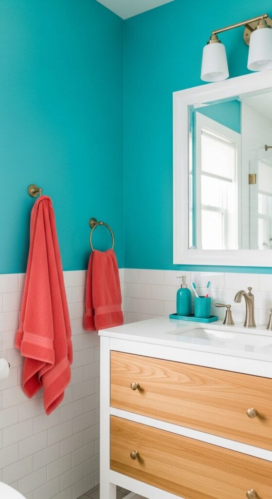
Coral and teal create an unexpectedly sophisticated color pairing. These complementary colors energize the space without feeling juvenile at all.
Coral brings warmth and playfulness while teal adds depth and sophistication. Together they create visual harmony that appeals across all age groups.
This palette works particularly well in bathrooms with limited natural light. Coral reflects warmth and makes the space feel sunny instantly.
Teal adds richness without feeling heavy or dark. The key is using both colors in similar proportions or letting one dominate with the other as accent.
Style Tip:
- Choose either coral or teal as your dominant color (60%), use the other as accent (40%)
- Add brass or gold fixtures—they warm up both colors beautifully
- Include white as your neutral base (tiles, fixtures, majority of walls)
- Consider coral or teal only on one wall, keeping others neutral
13. Monochrome Gray Sophistication
Gray offers the perfect neutral foundation that’s more interesting than beige. A monochromatic palette creates a sophisticated, spa-like atmosphere for everyone.
Kids find it calming at bedtime while guests appreciate the modern elegance. Different shades add depth without introducing competing colors or themes.
The practical benefits of gray are significant for busy family bathrooms. It hides soap scum and water spots better than pure white.
Mixing textures keeps the single-color palette from feeling flat. Think smooth tiles, matte paint, and polished fixtures for visual interest.
How to Achieve This Look:
- Choose 3-4 shades of gray from light to dark
- Use the lightest gray on walls, medium on vanity, darkest on floor
- Add abundant white through fixtures, towels, and countertop
- Include one metallic (silver, chrome, or brushed nickel) for polish
14. Playful Geometric Tiles with Neutral Base
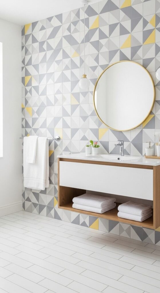
Geometric patterns add visual excitement that captures children’s attention instantly. When contained to one wall, bold patterns create focus without overwhelming.
The key is choosing patterns in a muted color palette. This feels contemporary rather than cartoonish or too juvenile.
This approach lets you embrace trend-forward design without full commitment. The geometric wall becomes the room’s artwork, eliminating need for additional decoration.
It provides that touch of personality that makes the space memorable. Your feature wall does all the heavy lifting design-wise.
Style Tip:
- Use geometric tiles on one wall only—your feature wall
- Choose patterns in 2-3 colors maximum, all in soft or muted tones
- Keep remaining walls, floor, and fixtures completely neutral
- Let the pattern be the only “busy” element in the room
15. Soft Lavender Dream Retreat
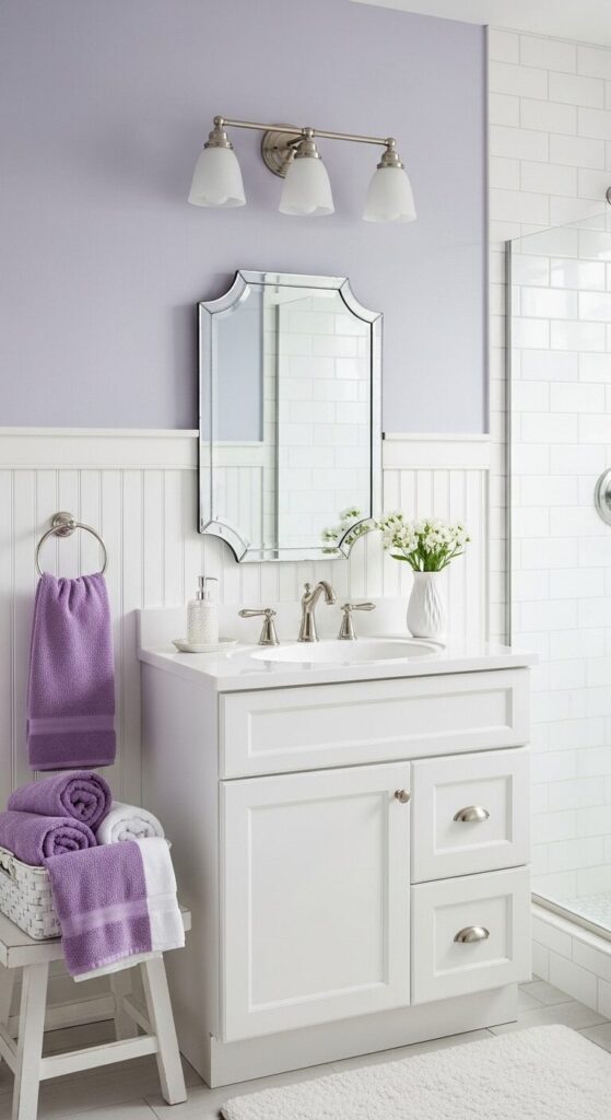
Lavender creates a dreamy, calming atmosphere perfect for winding down. This soft purple reads as sophisticated and spa-like rather than juvenile.
Especially when paired with plenty of white and vintage-inspired details. It’s a color that feels special and different without being overwhelming.
The beauty of lavender is its universal appeal across ages. It’s subtle enough for a guest bathroom while still feeling distinctive.
This color is incredibly forgiving in terms of undertones and lighting. Whether your space has warm or cool light, soft lavender adapts beautifully.
How to Achieve This Look:
- Choose soft, dusty lavender (not bright purple) for walls
- Add white wainscoting or beadboard to ground the color
- Use all white fixtures and abundant white towels
- Include silver or chrome hardware for a cool, clean feel
- Add one vintage or delicate element (mirror, light fixture, or accessories)
Final Styling Thoughts
Creating a bathroom that welcomes both kids and guests isn’t about compromise. It’s about thoughtful design that serves multiple purposes beautifully.
The most successful dual-purpose bathrooms start with a solid, neutral foundation. Then layer in personality through easily changeable elements like towels and accessories.
Invest in quality where it matters, embrace colors strategically, and remember organization is your secret weapon. With the right approach, your bathroom can be a space where everyone feels comfortable.
The best part? You don’t have to choose between playful and polished—you really can have both.
Today’s Inspiration
These 15 ideas prove that family-friendly doesn’t mean sacrificing style. Whether you’re drawn to soft pastels, bold navies, or crisp black and white, there’s an approach for you.
Start with one element that speaks to you—a color, a pattern, a specific tile. Build your design from there with confidence.
Remember, the goal isn’t perfection. It’s creating a space that works hard for your family while feeling beautiful to everyone who uses it.
Your bathroom can be practical, pretty, and personality-filled all at once. Let these ideas inspire your next refresh!