
There’s something undeniably magical about a black and white nursery.
The crisp contrast creates a serene backdrop that’s both sophisticated and playful, giving you endless room to add personal touches as your little one grows.
Unlike themed nurseries that might feel dated quickly, this timeless palette adapts beautifully through every stage of childhood.
Black and White Nursery Ideas
Whether you’re drawn to bold geometric patterns, soft organic textures, or minimal Scandinavian vibes, these monochrome spaces prove that simplicity can be absolutely stunning.
Let’s explore 15 beautiful ways to create a black and white nursery that feels fresh, cozy, and uniquely yours.
1. Classic Stripes with Soft Textures
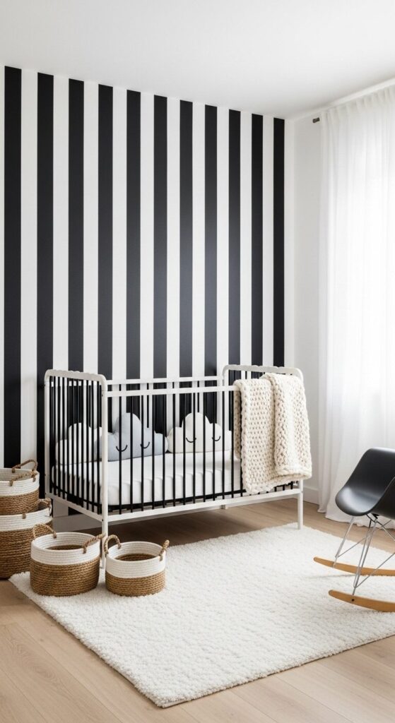
Picture crisp black and white vertical stripes running along one accent wall, paired with a plush white shag rug underfoot. The room feels clean and structured with its bold linear pattern drawing the eye upward.
A sleek black crib sits center stage, adorned with cloud-shaped pillows and a chunky knit blanket draped over the rail. The contrast between the graphic wall and soft textures creates visual interest without overwhelming the senses.
Velvet cushions in a cozy reading corner and woven baskets for toy storage add warmth that makes the space feel lived-in. Natural wood tones through shelving or a rocking chair soften the contrast and prevent the room from feeling too clinical.
The beauty of striped walls is their versatility—they can make low ceilings feel taller or narrow rooms appear wider. Keep the furniture simple and let the wall pattern be your statement piece for maximum impact.
How to Achieve This Look: Use removable peel-and-stick wallpaper for an easy stripe application that won’t damage walls.
Mix in at least three different textures—think faux fur, cotton, and linen—to create depth. A dimmer switch helps control the mood from playtime bright to sleepy-time soft.
2. Geometric Wonderland

Imagine walls adorned with playful geometric shapes—triangles, hexagons, and circles in varying sizes creating a modern art gallery feel. The patterns dance across one feature wall while keeping the remaining walls pure white for balance.
A white dresser doubles as a changing table, topped with black and white patterned storage boxes that echo the wall design. The geometric theme continues subtly through hexagonal floating shelves displaying small plants and baby keepsakes.
Underfoot, a bold black and white geometric rug anchors the space and defines the play area. Circular mirrors in different sizes create an installation that’s both decorative and practical for tummy time.
This look works because it stimulates baby’s developing vision while maintaining a grown-up aesthetic. The repeating shapes create rhythm without chaos, and the monochrome palette keeps it sophisticated.
Style Tip: Use vinyl wall decals for the geometric shapes—they’re repositionable and perfect for renters. Stick to 2-3 shape types maximum to avoid visual clutter.
Introduce one metallic accent like brass or copper in light fixtures to add warmth without breaking the color scheme.
3. Minimalist Scandinavian Serenity

Soft white walls create a peaceful canvas where simplicity reigns supreme. A natural wood crib with clean lines sits against the wall, dressed in crisp white linens with a single black accent pillow.
The Scandinavian approach celebrates negative space and functionality. A simple black metal mobile hangs above the crib, its geometric shapes casting gentle shadows when the light hits just right.
One black and white mountain mural or decal adds visual interest without overwhelming the calm atmosphere. A sheepskin rug draped over a minimalist rocking chair invites cozy feeding sessions.
Less truly is more here—every piece serves a purpose and nothing feels excessive. The room breathes easy, creating a tranquil environment perfect for rest and bonding.
How to Achieve This Look: Invest in quality natural materials like solid wood and organic cotton. Keep decor to a minimum—five thoughtfully chosen pieces beat twenty random ones.
Use open shelving sparingly and display only the most beautiful necessities. Let white space be part of your design.
How to Choose the Right Theme
Start by considering your home’s existing style—your nursery should feel like a natural extension. If your house leans modern, embrace bold graphics and clean lines in your black and white scheme.
For traditional homes, softer patterns and vintage-inspired furniture pieces work beautifully in monochrome. Think toile patterns, classic stripes, and ornate frames in black and white for a timeless feel.
Consider longevity too. Geometric patterns and nature-inspired designs transition easily from nursery to big kid room. Avoid overly baby-centric themes that you’ll want to change in two years.
4. Polka Dot Playfulness

Cheerful black dots of varying sizes scatter across white walls, creating movement and energy without overwhelming the space. The playful pattern adds personality while maintaining the sophisticated monochrome palette.
A black crib with white bedding keeps the room grounded, while a white dresser features black circular drawer pulls that echo the wall dots. The repetition of circles throughout creates a cohesive design story.
Incorporate the pattern in smaller doses too—polka dot curtains, a dotted lampshade, or a spotted changing pad cover. A simple black pendant light hangs overhead, its circular shape continuing the theme.
This design grows with your child beautifully. It feels youthful and fun for a baby but sophisticated enough that a toddler won’t outgrow it quickly.
Style Tip: Use a mix of dot sizes for visual interest—combine large statement dots with smaller confetti-style ones. Keep dots on just one or two walls to prevent sensory overload.
Add a pop of metallics through gold or silver dot decals for a glamorous twist that still reads monochrome.
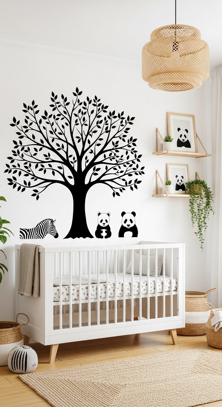
5. Nature-Inspired Black and White

A stunning black tree decal stretches across one wall, its branches reaching toward the ceiling with delicate leaves creating organic movement. The nature motif brings the outdoors in while maintaining the crisp monochrome aesthetic.
Wooden elements in natural or black-stained finishes add warmth—think a rustic wooden shelf displaying small potted plants and baby books. Animal prints in black and white (pandas, zebras, penguins) add whimsy without introducing color.
A white crib sits beneath the tree, creating the feeling that baby sleeps in a peaceful forest. Soft gray undertones in the bedding bridge the stark contrast and add depth to the palette.
This theme works because nature elements are inherently soothing. The organic shapes balance the bold color contrast, creating a space that feels both striking and serene.
How to Achieve This Look: Large tree decals are affordable and impactful—position them to frame the crib or changing area.
Add real greenery in safe spots to bring life to the space. Choose animal art that’s realistic rather than cartoonish for a look that ages well. Layer in natural textures like jute, cotton, and wood.
Budget-Friendly Tips
Paint is your best friend for dramatic impact without the hefty price tag. A black accent wall or hand-painted stripes cost only the price of supplies and your time.
DIY wall art using black frames from discount stores with free printables or your own designs creates custom decor for pennies. Gallery walls look expensive but can be done on any budget.
Shop secondhand for larger furniture pieces and give them new life with black or white paint. A $50 dresser transforms into a $500 look with the right finish and new hardware.
6. Bold Black Accent Wall

One wall painted in deep matte black creates instant drama and sophistication. Against this moody backdrop, a white crib and light wood furniture pop beautifully, creating a stunning focal point.
The dark wall actually makes the room feel cozy rather than small when balanced with plenty of white. Add floating white shelves that seem to hover against the black, creating striking visual contrast for displaying toys and books.
White bedding, a cream rug, and light curtains keep the space from feeling cave-like. The black wall grounds the design and gives you freedom to play with textures and patterns in lighter tones.
This approach is perfect for renters or commitment-phobes—if you tire of it, one wall is much easier to repaint than four. The bold choice makes a statement without overwhelming the entire room.
Style Tip: Use matte or chalkboard paint for the black wall—glossy finishes can feel harsh in a nursery. Mount white or natural wood pegboards on the black wall for practical storage that doubles as art.
Add warm-toned lighting to prevent the dark wall from feeling cold. Consider the wall opposite windows for best light balance.
7. Chevron Pattern Drama

Dynamic black and white chevron zigzags across one wall, creating energy and movement that draws the eye. The bold pattern makes a confident statement while the classic colors keep it from feeling too busy or dated.
A simple white glider with black legs sits in front of the chevron wall, becoming part of the design story. The pattern’s directionality creates visual flow and makes the room feel more spacious and intentional.
Keep other walls solid white to let the chevron breathe and prevent pattern overload. A solid black or white area rug grounds the space without competing with the wall, while simple bedding keeps the crib area calm.
Chevron works in nurseries because it’s gender-neutral, timeless, and adds instant style. The repeating pattern has a rhythmic quality that’s visually soothing despite its bold appearance.
How to Achieve This Look: Chevron wallpaper or decals are easier than painting and come in various stripe widths—choose wider chevrons for a more modern look.
Angle the pattern to point toward the room’s best feature. Balance the busy wall with solid, simple furniture pieces. Add texture through knit blankets and woven baskets.
Quick Styling Checklist
Walls: Choose one statement element—stripes, dots, mural, or solid color. Keep remaining walls simple to balance your bold choice.
Furniture: Mix finishes—all white can feel sterile, all black too heavy. Combine white cribs with black dressers or vice versa for visual interest.
Textiles: Layer at least three different textures in bedding, rugs, and curtains. Soft elements prevent the monochrome palette from feeling stark or cold.
Lighting: Include multiple light sources at different levels—overhead, task lighting, and a soft nightlight. Warm bulbs are essential for coziness.
Accessories: Group items in odd numbers (3 or 5) for visual appeal. Use varied heights when displaying decor on shelves or dressers.
8. Monochrome Gallery Wall
A carefully curated collection of black frames in various sizes creates an art gallery feel above the crib or changing station. Each frame holds black and white prints—animals, abstracts, letters spelling baby’s name, or meaningful quotes.
The beauty of a gallery wall is its flexibility. Start with a few key pieces and add over time as you find prints that speak to you or mark special moments.
Mix frame styles slightly—some thin, some thick, maybe one round frame among the rectangles. The variation adds interest while the consistent black color keeps it cohesive and intentional.
White matting inside frames provides breathing room for each piece. The negative space prevents the wall from feeling cluttered even with multiple frames grouped together.
Style Tip: Lay your gallery wall arrangement on the floor first and take a photo before hanging. Use painter’s tape to mark frame positions on the wall.
Maintain 2-3 inches between frames for optimal spacing. Include one piece slightly larger than the others as an anchor point. Update prints easily as baby grows.
9. Graphic Black Crib Statement

A stunning black metal crib with clean modern lines becomes the room’s centerpiece against pure white walls. Its dark silhouette creates instant sophistication and anchors the entire design scheme.
White bedding with subtle black patterns—tiny stars, thin stripes, or delicate illustrations—dresses the crib without competing with its strong presence. A black and white mobile hangs above, creating movement and visual interest.
Surround the dramatic crib with lighter elements to let it shine. A white dresser, pale gray rocking chair, and cream-colored rug ensure the black crib remains the star without making the room feel dark.
This approach works beautifully when you want drama on a budget. One statement furniture piece in black carries the whole color scheme, allowing you to keep other elements simple and affordable.
How to Achieve This Look: Look for cribs with interesting details like geometric railings or curved legs that create visual interest. Position the crib as the room’s focal point—centered on the main wall.
Use bedding in varying shades of white and cream to add depth. Consider a black crib that converts to a toddler bed for long-term value.
Color Palettes That Work Best
Pure Contrast: Stark black and white with no grays creates the boldest, most graphic look. This high-contrast combination is excellent for baby’s visual development and photographs beautifully.
Soft Monochrome: Introduce multiple shades of gray between black and white for a gentler, more layered approach. This palette feels sophisticated and creates depth without additional colors.
Warm Neutrals: Blend black and white with cream, beige, and natural wood tones. The warm undertones soften the contrast and create a cozier, more inviting atmosphere.
Cool Undertones: Pair black and white with blue-grays and cool whites for a crisp, modern Scandinavian feel. This combination feels fresh and calming.
10. Rug as the Focal Point
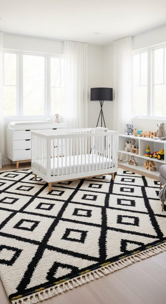
A bold black and white area rug with striking patterns—Moroccan tiles, geometric designs, or graphic florals—anchors the room and defines the play space. The rug brings pattern to the floor level, drawing the eye down and making the room feel grounded.
Keep walls and furniture simpler when your rug makes the statement. White walls, a simple crib, and streamlined storage let the rug shine without visual competition.
The rug also serves practical purposes beyond aesthetics. It provides soft surface for tummy time, cushions inevitable tumbles, and helps with sound absorption in a room where quiet matters.
Choose a rug that’s easy to clean because nurseries see their share of spills and accidents. Flat-weave or low-pile rugs work better than shag for baby safety and maintenance.
Style Tip: Size matters—go larger than you think you need. The rug should extend at least 18 inches beyond furniture on all sides. Use a rug pad underneath for safety and comfort.
Choose synthetic materials or washable rugs for practical nursery use. The rug can transition to a playroom or bedroom as baby grows.
11. Window Treatment Drama

Floor-to-ceiling black and white curtains frame the windows with sophistication, adding height and drama to the space. Bold striped or geometric patterned curtains create a custom designer look while serving practical light-blocking purposes.
Layer sheer white curtains underneath for daytime privacy and light filtering, with heavier black-out curtains over top for naptime darkness. The layered approach gives you flexibility and adds dimensional interest.
The vertical lines of drapes draw the eye upward, making standard ceiling heights feel more impressive. Mounting curtain rods near the ceiling rather than just above the window frame maximizes this effect.
Window treatments often get overlooked in nursery design, but they’re an opportunity for impact. They frame your view like artwork and tie the room’s color scheme together beautifully.
How to Achieve This Look: Measure for curtains that puddle slightly on the floor for a luxe look—add 2-3 inches to your length. Choose cordless options or tie-up mechanisms for baby safety.
Install double curtain rods for layering sheers and blackout panels. Consider wide striped patterns that won’t feel busy—4-6 inch stripes hit the sweet spot.
12. Subtle Damask Elegance

Traditional damask wallpaper in black and white brings refined elegance with its intricate botanical patterns. The ornate design adds visual texture and sophisticated detail without overwhelming the space when used on just one wall.
This classic pattern bridges vintage and modern aesthetics beautifully. It feels grown-up and permanent, perfect for parents who want a nursery that doesn’t scream “baby room” and can transition to a child’s room easily.
Pair the elaborate wallpaper with simple, clean-lined furniture that won’t compete. A white crib, streamlined dresser, and minimal accessories let the wall pattern remain the sophisticated focal point.
The subtle tone-on-tone quality of black on white damask adds depth and interest while maintaining the monochrome scheme. Up close it’s detailed; from far away it reads as elegant texture.
Style Tip: Damask works best in rooms with good natural light—dark rooms can make the pattern feel heavy. Use it on the wall behind the crib or opposite the entrance for maximum impact.
Balance the ornate pattern with modern elements like sleek lighting or contemporary frames. Consider damask in smaller doses like curtains or chair upholstery if full walls feel like too much.
13. Floating Shelves Display

Black floating shelves mounted against white walls create a striking display system that’s both functional and artistic. The shelves appear to float weightlessly, showcasing toys, books, and decor like a carefully curated exhibition.
Arrange items with intention—alternate black and white objects, vary heights, and leave strategic empty space. The negative space is as important as the items displayed, preventing the shelves from feeling cluttered.
Use the shelves to display rotating collections as baby grows. Newborn stage might show soft toys and keepsakes; toddler years can feature books and favorite characters, all within the monochrome palette.
The linear shelves add architectural interest to plain walls and provide storage without taking up floor space. They’re also easily adjustable as your needs change.
How to Achieve This Look: Install shelves at varying heights for visual interest rather than perfectly aligned. Use sturdy brackets rated for weight—baby books are heavier than they look.
Display in groups of three for pleasing composition. Anchor larger items at the ends with smaller pieces in between. Add small plants or framed photos between toys and books.
14. Chalkboard Wall Fun

One wall covered in chalkboard paint becomes an ever-changing canvas for creativity and milestones. Draw monthly growth markers, sweet messages, or simple designs that evolve as baby grows into toddlerhood.
The matte black surface provides dramatic backdrop while serving future interactive purposes. For now, use white chalk markers to add temporary decorative elements—a simple tree, baby’s name in pretty lettering, or milestone dates.
Keep the chalkboard wall balanced with plenty of lighter elements. White furniture, soft textiles, and good lighting prevent the dark wall from overwhelming the space or making it feel closed in.
This feature grows with your child better than almost any other nursery element. What starts as decorative becomes functional when little hands start drawing their own masterpieces.
Style Tip: Use high-quality chalkboard paint and apply multiple coats for best results. Season the wall by rubbing chalk over the entire surface and erasing before first use.
Keep chalk in a cute basket nearby but out of baby’s reach initially. Plan this wall opposite or adjacent to windows for best natural light. Add a ledge below for chalk storage and displaying art supplies.
15. Mixed Pattern Magic

Confidently mix multiple black and white patterns—stripes on the curtains, polka dots on the rug, geometric prints in wall art, and a subtle print on the rocking chair cushion. The monochrome palette unifies everything despite the pattern variety.
The key to successful pattern mixing is varying the scale. Pair large bold patterns with smaller delicate ones, and include one solid element to give the eye a resting place.
This maximalist approach within a minimalist color scheme creates depth and personality. The room feels collected over time rather than bought all at once, giving it character and charm.
Start with your favorite pattern as the anchor, then build around it with complementary designs. The black and white restriction actually makes mixing easier—you can’t go wrong when color isn’t a factor.
How to Achieve This Look: Follow the rule of three—combine three different patterns maximum for cohesion. Include one large-scale, one medium, and one small-scale pattern.
Add solid black or white between patterns to prevent visual chaos. Use the same pattern twice in different places (like matching curtains and throw pillows) to create intentional repetition. Test pattern combinations by holding swatches together before committing.
Final Thoughts
A black and white nursery offers a perfect foundation that’s both timeless and adaptable. These monochrome spaces prove that limiting your color palette doesn’t limit your creativity—it actually enhances it by forcing you to play with pattern, texture, and form in more interesting ways.
The beauty of this classic combination is its longevity. Unlike trendy colors that may feel dated in a few years, black and white remains forever chic.
You can easily add pops of color through accessories as your child develops preferences, making this palette the perfect long-term investment.
Whether you lean toward bold graphics, soft textures, or elegant patterns, your black and white nursery will be a serene sanctuary for both you and your little one. Trust your instincts, have fun with the process, and create a space filled with love and style.