
The living room serves as the heart of any home—a space where families gather, friends connect, and individuals find solace after a long day.
While neutral palettes have dominated interior design trends for years, incorporating vibrant hues can transform an ordinary living space into an extraordinary expression of personality.
Color psychology suggests that the shades surrounding us significantly influence our mood and energy levels, making chromatic choices in our most-used spaces particularly consequential.
This comprehensive guide explores 18 imaginative approaches to infuse your living room with color, from subtle accents to audacious statements.
Whether you’re a color connoisseur seeking fresh inspiration or a chromophobic homeowner ready to venture beyond beige, these ideas offer practical pathways to create a living space that’s not just aesthetically pleasing but emotionally resonant.
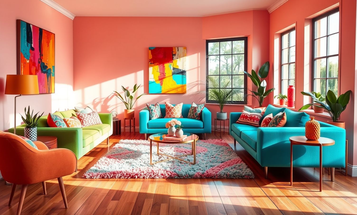
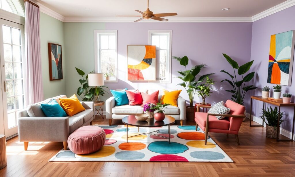
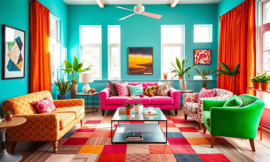
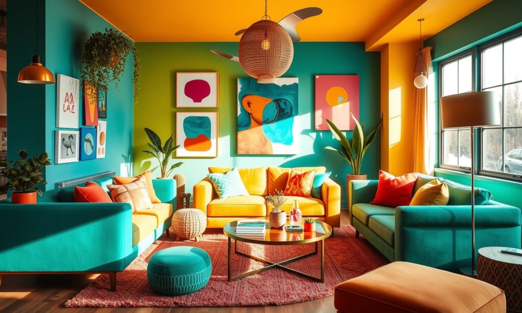
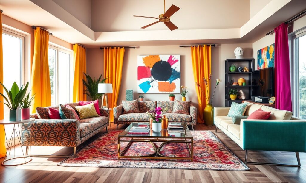
Colorful Living Room Ideas
Let’s embark on this polychromatic journey to discover how strategic splashes of color can revitalize your living area without overwhelming the senses.
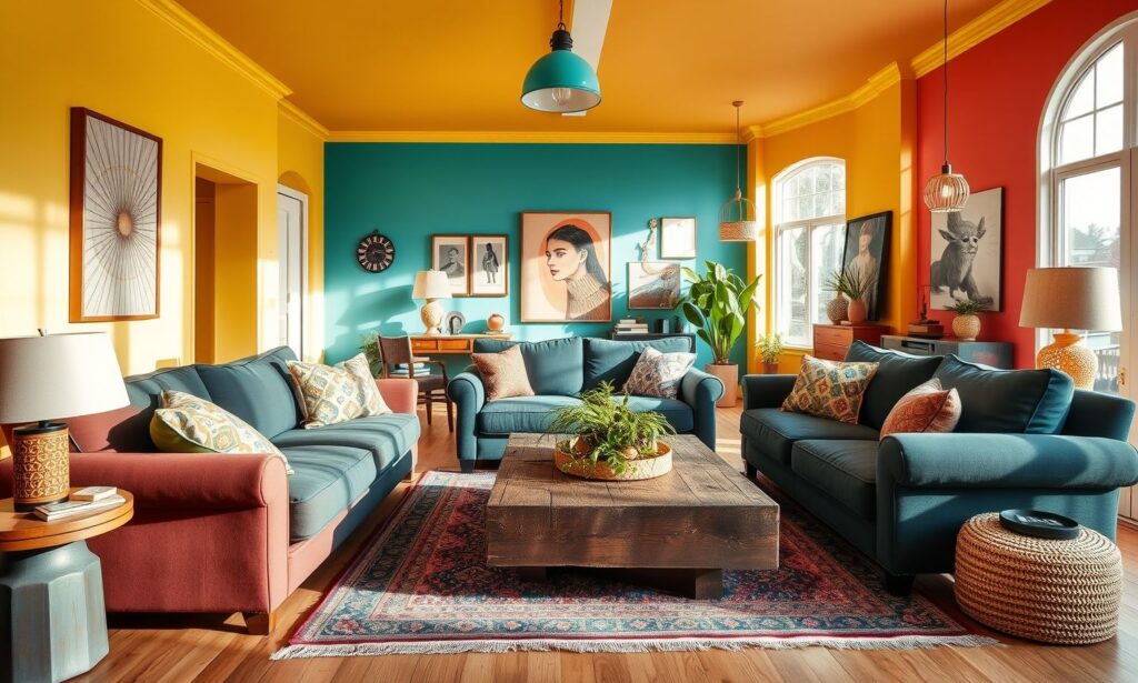
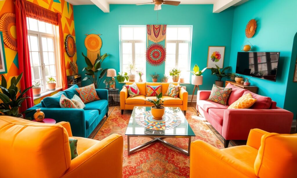
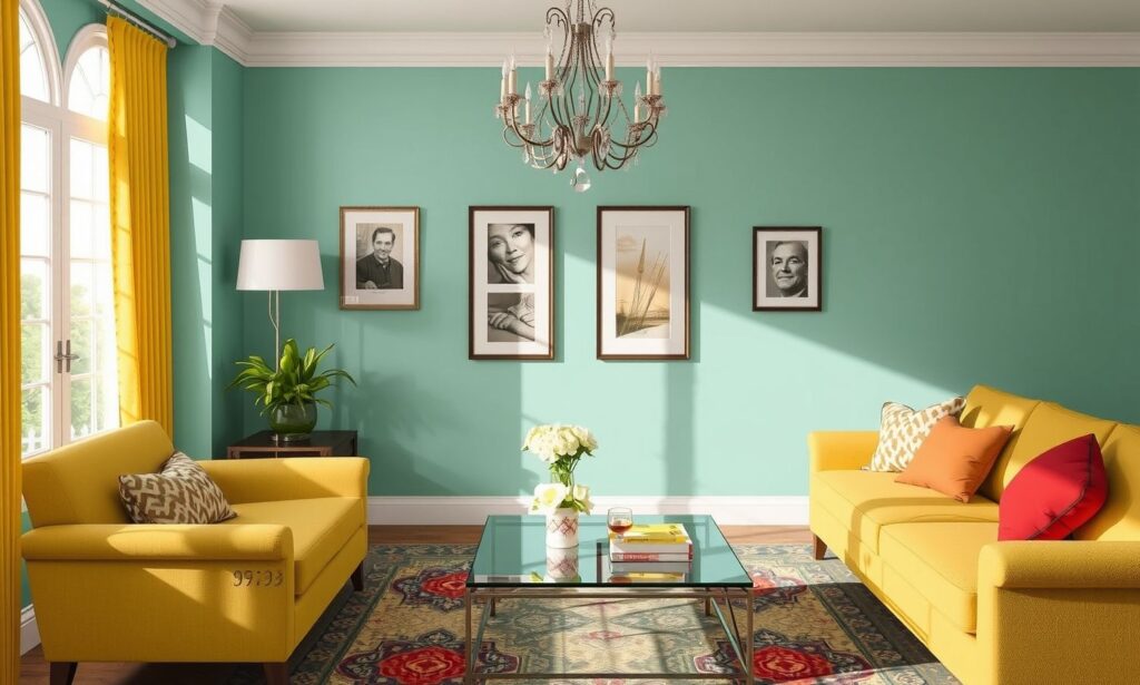
1. Bold Accent Wall
An accent wall serves as a focal point that can dramatically transform your living room’s atmosphere without overwhelming the space. This strategic design choice allows you to experiment with vibrant colors that might feel excessive when applied to every wall.
Choose a wall that naturally draws attention—perhaps the one behind your sofa or fireplace. Deep jewel tones like emerald green or sapphire blue create sophisticated drama, while coral or mustard yellow inject energy and warmth. For maximum impact, ensure your accent wall color appears elsewhere in the room through accessories or artwork, creating visual continuity that ties your design together seamlessly.
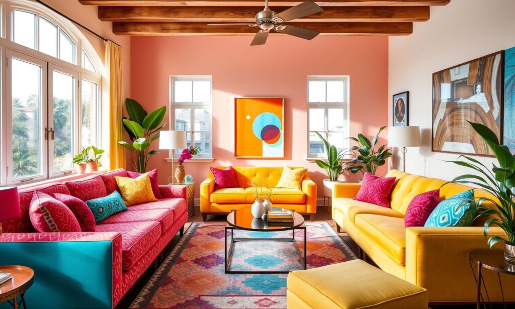
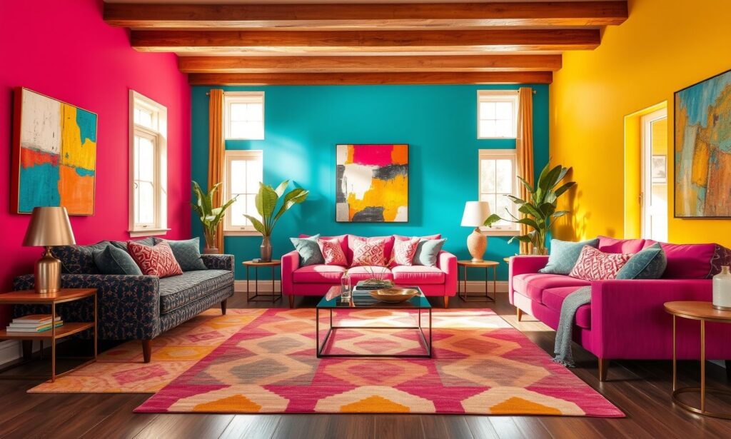
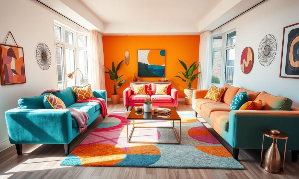
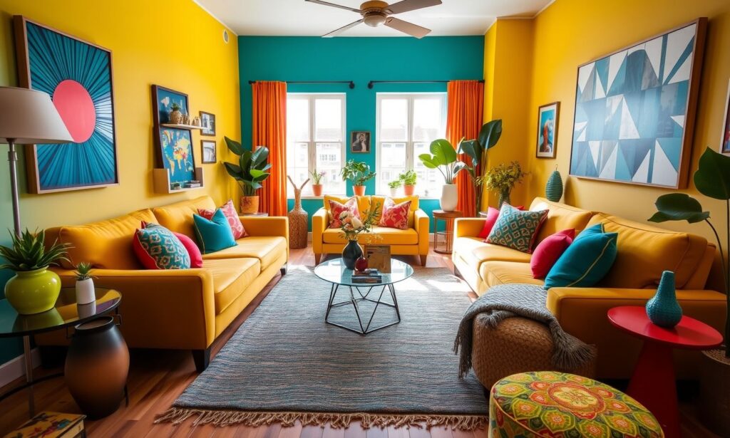
2. Colorful Furniture Statements
Statement furniture pieces in vivid hues offer a commitment to color that remains changeable, unlike permanent structural elements. A cobalt blue sofa or emerald armchairs can anchor your living room design while expressing personal style with confidence.
When selecting colorful furniture, consider how these pieces will interact with your existing décor. Balance is crucial—pair your vibrant furniture with neutral walls and flooring to let the pieces shine without competition. Alternatively, choose furniture in complementary colors to create a cohesive yet dynamic space that feels intentionally designed rather than accidentally assembled.
3. Layered Textiles and Fabrics
Textiles represent perhaps the most accessible entry point into color experimentation, offering low-risk opportunities to incorporate vibrant hues. Throw pillows, blankets, and curtains can be easily replaced as your preferences evolve, making them ideal vehicles for seasonal color refreshes.
Create visual depth by layering textiles in varying shades and textures. Consider mixing patterns that share color families—floral pillows alongside geometric throws, for instance—to create interest without chaos. Don’t overlook the transformative power of window treatments; richly colored curtains can function as vertical color blocks that draw the eye upward and make your space feel more expansive.
4. Nature-Inspired Color Palettes
Drawing color inspiration from nature ensures harmonious combinations that feel inherently balanced. Forest-inspired schemes featuring mossy greens, bark browns, and sky blues create living spaces that feel both refreshing and grounding.
Implementing nature’s palettes doesn’t mean recreating literal landscapes. Instead, extract color relationships from favorite outdoor scenes—perhaps the dusty purples and oranges of a desert sunset or the varied blues and grays of a stormy seascape. These organic combinations tend to work together effortlessly, providing sophisticated color direction even for design novices.
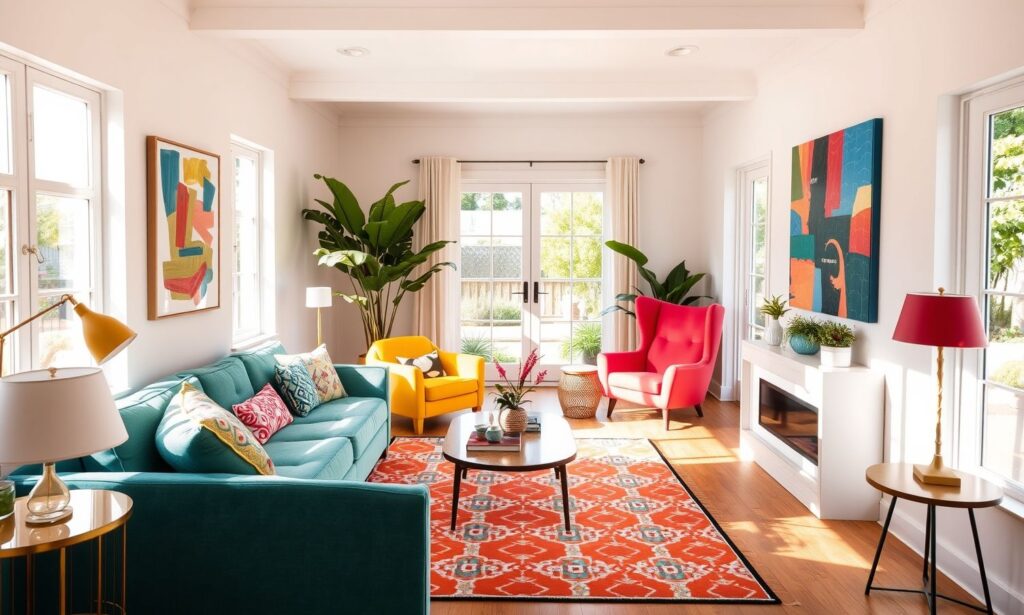
5. Color Through Artwork and Accessories
Art pieces and decorative objects offer concentrated color opportunities that make significant visual impact without permanent commitment. A large-scale painting or gallery wall can introduce multiple hues that inspire the rest of your design scheme.
When selecting artwork, look for pieces that both speak to you emotionally and incorporate colors you’re drawn to. Let these colors inform your accessory choices—books, vases, and sculptural objects can echo and amplify the hues in your art. This approach creates a curated feeling while providing a ready-made color palette that removes the guesswork from design decisions.
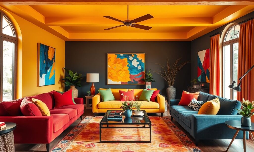
6. Painted Ceiling Techniques
While often neglected, ceilings offer substantial surface area for colorful expression. A painted ceiling—sometimes called the “fifth wall”—can create dramatic spatial effects while introducing unexpected color to your living room.
For subtle impact, choose a lighter version of your wall color or a complementary pale hue that enhances the room’s overall palette. More adventurous homeowners might explore deeper colors that visually lower the ceiling, creating intimacy in expansive spaces. Alternatively, geometric patterns or ombré effects can transform a flat ceiling into an artistic focal point that guests won’t soon forget.
7. Colorful Built-Ins and Shelving
Built-in bookcases and shelving units provide perfect opportunities to introduce color through structural elements. Painting the back panels of shelves creates depth and visual interest, highlighting the objects displayed while adding chromatic dimension.
Consider painting built-ins in colors that contrast with your walls—navy shelves against white walls or sage green cabinetry in a neutral room. For more subtle approaches, maintain the same color family but use different intensity levels. The contents of your shelves—books arranged by color, colorful pottery, or curated collections—further enhance this layered color approach.
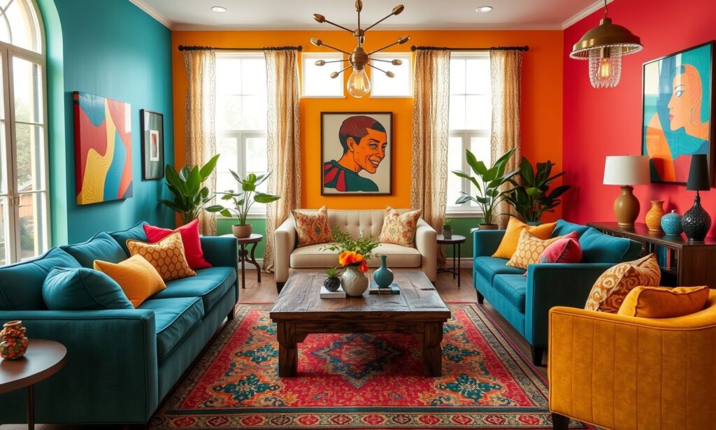
8. Geometric Color Blocking
Color blocking incorporates multiple hues in geometric patterns, creating visual structure through color relationships. This technique borrows from modern art movements, bringing bold graphic sensibility to living space design.
Start with complementary or analogous colors for harmonious blocking effects. Simple implementations might include painting rectangular sections of walls in different colors or using furniture and rugs to create color zones within your space. More elaborate approaches could involve diagonal paint divisions or architectural paint treatments that emphasize existing structural features through strategic color placement.
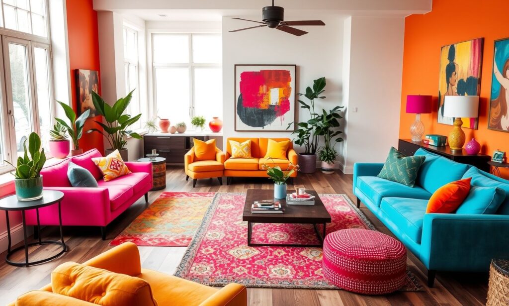
9. Unexpected Color Combinations
Breaking conventional color rules can result in strikingly original living spaces that reflect genuine personal style. Unexpected pairings—lavender with olive green or coral with navy—create sophisticated tension that elevates your design beyond the ordinary.
The secret to successful unusual combinations lies in finding common undertones or creating balance through proportion. When working with unconventional color relationships, maintain consistency in other design elements—similar wood tones or metal finishes throughout the space, for instance—to provide unifying threads that make experimental color feel intentional rather than chaotic.
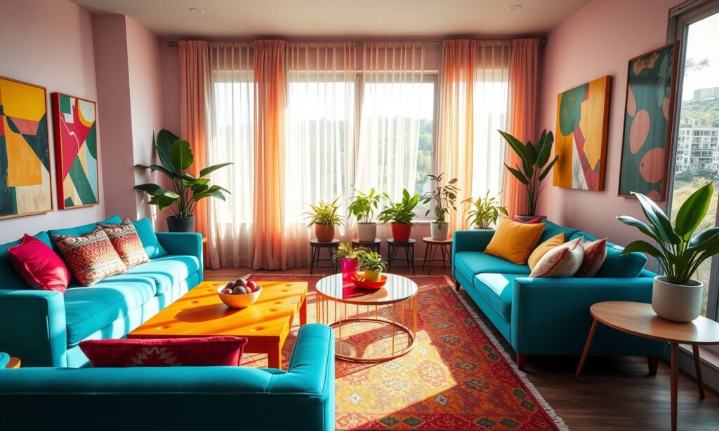
10. Vibrant Area Rugs
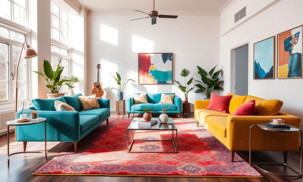
A colorful area rug anchors your living room while introducing pattern and texture alongside hue. As one of the largest accessories in your space, rugs make significant visual impact while remaining relatively easy to change.
Select rugs that incorporate multiple colors from your overall palette to create cohesion between flooring and furnishings. Consider how different rug placements affect your space—a centered placement under a coffee table creates a traditional arrangement, while asymmetrical positioning can energize your layout. Remember that rug colors appear more intense in larger expanses, so what seems bright in a small sample may provide just the right color intensity when scaled up.
11. Color-Drenched Monochromatic Approach
Embracing a single color throughout your living room creates dramatic cohesion and unexpected sophistication. This monochromatic approach uses varying shades, tints, and textures of one color family to create depth without introducing competing hues.
Successful monochromatic rooms rely on textural variation to prevent flatness—consider velvet throw pillows against linen upholstery or glossy ceramic accessories atop matte painted surfaces. Incorporate natural elements like wood and stone to provide neutral interruptions that enhance your chosen color rather than compete with it. This approach works particularly well with complex colors like slate blue, olive green, or terracotta that contain subtle variations within themselves.
12. Seasonal Color Rotation
Embracing seasonal color changes keeps your living space feeling fresh and responsive to natural rhythms. This approach involves a neutral base scheme supplemented by rotating accent colors that reflect seasonal shifts.
Develop a collection of seasonal accessories—pillows, throws, vases, and art pieces—that can be swapped quarterly. Spring might bring forward leafy greens and soft yellows, while autumn introduces burnt orange and deep burgundy. This rotational approach satisfies our innate desire for novelty while maintaining design consistency through your foundational pieces.
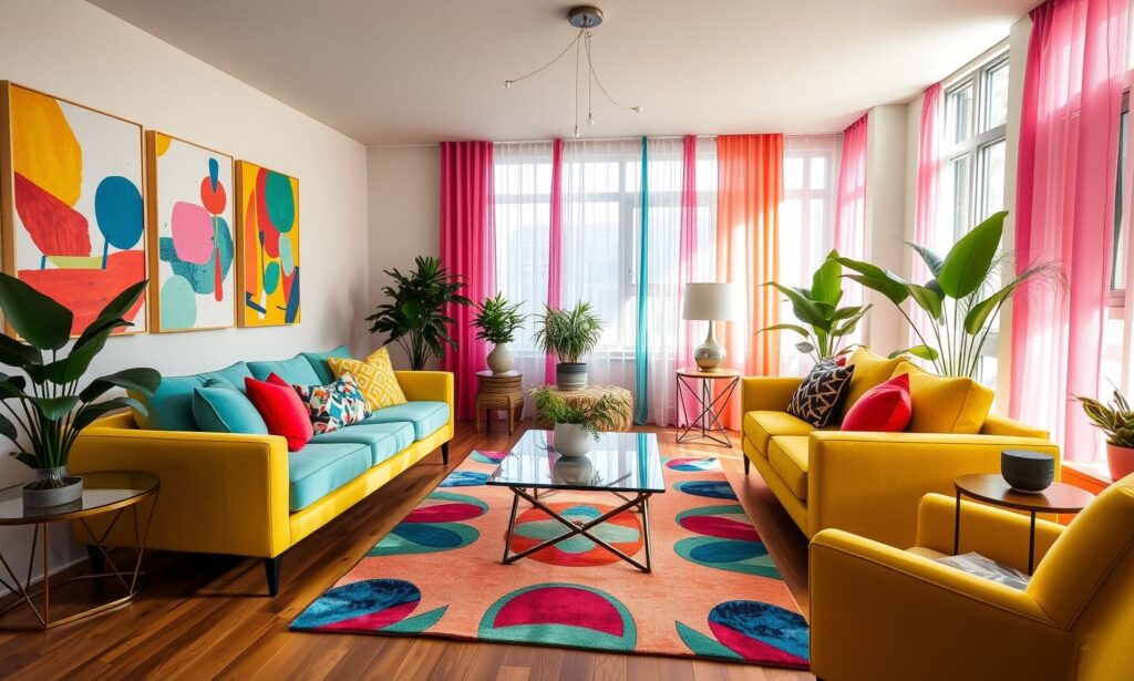
13. Colorful Window Treatments
Window treatments offer vertical color opportunities that draw the eye upward and frame your view. From Roman shades to floor-length drapes, these textiles can introduce bold colors or patterns that might overwhelm in larger applications.
Consider how light interacts with colored window coverings—semi-transparent fabrics create colored light effects as sunlight filters through, while opaque materials provide stronger color statements. Layering window treatments (sheer curtains beneath solid drapes, for instance) allows for variable light control while introducing multiple colors or textures to your window design.
14. Painted Furniture Transformations
Refinishing existing furniture pieces in vibrant colors breathes new life into cherished items while adding chromatic interest to your living room. This sustainable approach personalizes your space without requiring new purchases.
Start with quality pieces that have good structural integrity but tired finishes. Chalk paint in saturated colors transforms traditional wooden furniture with minimal preparation, while glossy lacquer finishes suit more contemporary pieces. Consider color relationships between multiple painted pieces—complementary colors for energetic contrast or analogous hues for subtle sophistication.
15. Color Through Plants and Botanicals
Living plants introduce natural color variations through foliage and blooms, bringing organic energy to your color scheme. Beyond common green plants, consider purple-leaved varieties, colorful bromeliads, or flowering plants that complement your design palette.
Create plant groupings that incorporate various heights, textures, and colors for maximum impact. Large-scale plants like fiddle leaf figs or bird of paradise provide substantial color blocks, while smaller specimens offer detailed color notes. Don’t overlook the contribution of decorative pots and planters, which provide additional opportunities to reinforce your color scheme.
16. Lighting for Color Enhancement
Strategic lighting dramatically affects how colors are perceived in your living room. Both natural and artificial light sources influence color appearance, making lighting an essential consideration in colorful room design.
Position lamps to highlight your most vibrant elements, and choose bulb temperatures that enhance your color choices—warmer bulbs (2700-3000K) intensify reds and yellows, while cooler temperatures (3500-4100K) better showcase blues and greens. Consider color-changing smart bulbs that allow you to adjust lighting hues for different moods or times of day, effectively creating multiple color schemes within one designed space.
17. Gradient and Ombré Effects
Gradual color transitions create sophisticated visual interest that feels both contemporary and organic. These techniques can be applied to walls, textiles, or accessories to introduce multiple colors in a cohesive manner.
Wall treatments can incorporate vertical or horizontal color gradients that transition between complementary or analogous hues. For less permanent applications, seek out textiles and accessories that feature gradient effects—ombré curtains, throw pillows, or artwork. These elements add depth and movement to your color scheme while demonstrating intentional color relationships.
18. Two-Tone Wall Treatments
Dividing walls horizontally with different colors creates architectural interest while allowing for bolder color choices. This technique often involves darker colors below and lighter shades above, though creative inversions can produce dramatic results.
Traditional applications include wainscoting or chair rails that create natural division points between colors. Contemporary approaches might use simple painted lines or geometric divisions that create color blocking without additional architectural elements. This approach effectively grounds spaces with darker base colors while maintaining lightness and openness with paler upper walls.
Conclusion
The journey to a more colorful living room doesn’t require radical transformation—even modest chromatic additions can significantly impact your space’s atmosphere and your emotional response to it. The 18 ideas presented here offer entry points for color enthusiasts at every comfort level, from subtle accessorizing to comprehensive color immersion.
Remember that successful colorful spaces typically maintain balance through deliberate limitations; rather than incorporating every hue, develop a considered palette that reflects your personal aesthetic and supports your desired mood.
As you experiment with these approaches, trust your intuitive responses to different colors and combinations. The most successful living rooms reflect their inhabitants’ personalities while supporting their lifestyle needs. By thoughtfully incorporating color—whether through temporary accessories or more permanent features—you create a living environment that energizes, comforts, and truly feels like home.